파이썬 - Matplotlib
PYTHON PROGRAMMING FUNDAMENTALS
Tidy Data
- each variable is a column
- each observation is a row
- each type of observational unit is a table


ref:
https://matplotlib.org/gallery.html#scales
https://seaborn.pydata.org/
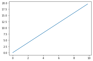
가장기본적인 Plot
import matplotlib.pyplot as plt
import numpy as np
x = np.arange(0,10,0.2)
x
array([0. , 0.2, 0.4, 0.6, 0.8, 1. , 1.2, 1.4, 1.6, 1.8, 2. , 2.2, 2.4,
       2.6, 2.8, 3. , 3.2, 3.4, 3.6, 3.8, 4. , 4.2, 4.4, 4.6, 4.8, 5. ,
       5.2, 5.4, 5.6, 5.8, 6. , 6.2, 6.4, 6.6, 6.8, 7. , 7.2, 7.4, 7.6,
       7.8, 8. , 8.2, 8.4, 8.6, 8.8, 9. , 9.2, 9.4, 9.6, 9.8])
y = 2 * x
y
array([ 0. ,  0.4,  0.8,  1.2,  1.6,  2. ,  2.4,  2.8,  3.2,  3.6,  4. ,
        4.4,  4.8,  5.2,  5.6,  6. ,  6.4,  6.8,  7.2,  7.6,  8. ,  8.4,
        8.8,  9.2,  9.6, 10. , 10.4, 10.8, 11.2, 11.6, 12. , 12.4, 12.8,
       13.2, 13.6, 14. , 14.4, 14.8, 15.2, 15.6, 16. , 16.4, 16.8, 17.2,
       17.6, 18. , 18.4, 18.8, 19.2, 19.6])
plt.plot(x,y)

plt.show()
Bar Charts
import numpy as np
import pandas as pd
import matplotlib.pyplot as plt
import seaborn as sb

%matplotlib inline
df = pd.read_csv('pokemon.csv')
df.head()
| id | species | generation_id | height | weight | base_experience | type_1 | type_2 | hp | attack | defense | speed | special-attack | special-defense | |
|---|---|---|---|---|---|---|---|---|---|---|---|---|---|---|
| 0 | 1 | bulbasaur | 1 | 0.7 | 6.9 | 64 | grass | poison | 45 | 49 | 49 | 45 | 65 | 65 |
| 1 | 2 | ivysaur | 1 | 1.0 | 13.0 | 142 | grass | poison | 60 | 62 | 63 | 60 | 80 | 80 |
| 2 | 3 | venusaur | 1 | 2.0 | 100.0 | 236 | grass | poison | 80 | 82 | 83 | 80 | 100 | 100 |
| 3 | 4 | charmander | 1 | 0.6 | 8.5 | 62 | fire | NaN | 39 | 52 | 43 | 65 | 60 | 50 |
| 4 | 5 | charmeleon | 1 | 1.1 | 19.0 | 142 | fire | NaN | 58 | 64 | 58 | 80 | 80 | 65 |
df.shape
(807, 14)
df.describe()
| id | generation_id | height | weight | base_experience | hp | attack | defense | speed | special-attack | special-defense | |
|---|---|---|---|---|---|---|---|---|---|---|---|
| count | 807.000000 | 807.000000 | 807.000000 | 807.000000 | 807.000000 | 807.000000 | 807.000000 | 807.000000 | 807.000000 | 807.000000 | 807.000000 |
| mean | 404.000000 | 3.714994 | 1.162454 | 61.771128 | 144.848823 | 68.748451 | 76.086741 | 71.726146 | 65.830235 | 69.486989 | 70.013631 |
| std | 233.105126 | 1.944148 | 1.081030 | 111.519355 | 74.953116 | 26.032808 | 29.544598 | 29.730228 | 27.736838 | 29.439715 | 27.292344 |
| min | 1.000000 | 1.000000 | 0.100000 | 0.100000 | 36.000000 | 1.000000 | 5.000000 | 5.000000 | 5.000000 | 10.000000 | 20.000000 |
| 25% | 202.500000 | 2.000000 | 0.600000 | 9.000000 | 66.000000 | 50.000000 | 55.000000 | 50.000000 | 45.000000 | 45.000000 | 50.000000 |
| 50% | 404.000000 | 4.000000 | 1.000000 | 27.000000 | 151.000000 | 65.000000 | 75.000000 | 67.000000 | 65.000000 | 65.000000 | 65.000000 |
| 75% | 605.500000 | 5.000000 | 1.500000 | 63.000000 | 179.500000 | 80.000000 | 95.000000 | 89.000000 | 85.000000 | 90.000000 | 85.000000 |
| max | 807.000000 | 7.000000 | 14.500000 | 999.900000 | 608.000000 | 255.000000 | 181.000000 | 230.000000 | 160.000000 | 173.000000 | 230.000000 |
df['species'].nunique()
807
df['species'].describe()
count            807
unique           807
top       chandelure
freq               1
Name: species, dtype: object
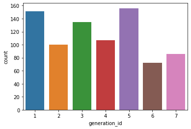
# 제너레이션 아이디별로, 각 각 몇개씩 있는지 차트로 표시
sb.countplot(data = df , x= 'generation_id')

plt.show()
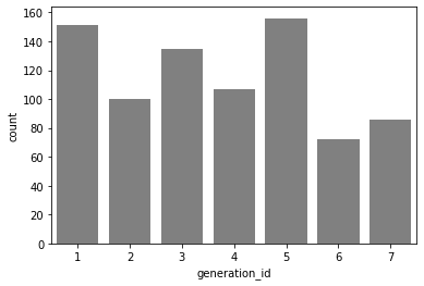
base_color = sb.color_palette()[7]
sb.countplot(data = df , x= 'generation_id',color= 'gray')

plt.show()
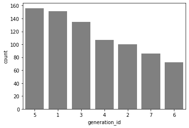
df['generation_id'].value_counts().index
Int64Index([5, 1, 3, 4, 2, 7, 6], dtype='int64')
my_order = df['generation_id'].value_counts().index
sb.countplot(data = df , x= 'generation_id',color= 'gray',order=my_order)

plt.show()
# type_1 도 카네고리컬 데이터 인거 같습니다.
# type_1 은  어떤 데이터들로 되어있는지 먼저 확인
# type_1 의 데이터 갯수를 카운트 플룻으로 그려보세요
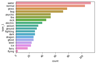
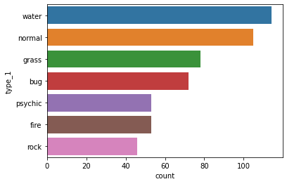
my_order = df['type_1'].value_counts().index
sb.countplot(data=df, y='type_1',order=my_order)
plt.xticks(rotation = 45)
plt.show()
sb.countplot(data=df, y= 'type_1',order=my_order[0:6+1])

plt.show()
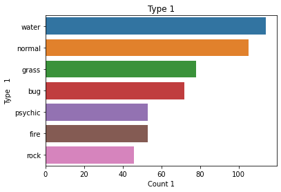
sb.countplot(data=df, y= 'type_1',order=my_order[0:6+1])

plt.title('Type 1')
plt.xlabel('Count 1')
plt.ylabel('Type   1')
plt.show()
Pie Charts
# 퍼센테이지로 비교!!!
df.head(3)
| id | species | generation_id | height | weight | base_experience | type_1 | type_2 | hp | attack | defense | speed | special-attack | special-defense | |
|---|---|---|---|---|---|---|---|---|---|---|---|---|---|---|
| 0 | 1 | bulbasaur | 1 | 0.7 | 6.9 | 64 | grass | poison | 45 | 49 | 49 | 45 | 65 | 65 |
| 1 | 2 | ivysaur | 1 | 1.0 | 13.0 | 142 | grass | poison | 60 | 62 | 63 | 60 | 80 | 80 |
| 2 | 3 | venusaur | 1 | 2.0 | 100.0 | 236 | grass | poison | 80 | 82 | 83 | 80 | 100 | 100 |
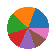
# 파이 차트를 그리기 위해서는,
# 각 제너레이션 아이디 별로, 데이터가 몇개인지 , 먼저 있어야 한다.
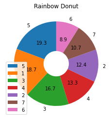
sorted_df = df['generation_id'].value_counts()
sorted_df
5    156
1    151
3    135
4    107
2    100
7     86
6     72
Name: generation_id, dtype: int64
plt.pie(sorted_df)

plt.show()
# autopct = '%.xf' x는 소수점 자릿수 표현, f는 실수이기때문에 적어줘야함.
plt.pie(sorted_df, autopct='%.1f', labels= sorted_df.index,
       startangle=90, wedgeprops={'width' : 0.7})
plt.title("Rainbow Donut")
plt.legend()

plt.show()
히스토그램 - 해당 레인지의 갯수
.png)
# 하나의 구간 : bin , 여러개니까 bins
.png)
.png)
df
| id | species | generation_id | height | weight | base_experience | type_1 | type_2 | hp | attack | defense | speed | special-attack | special-defense | |
|---|---|---|---|---|---|---|---|---|---|---|---|---|---|---|
| 0 | 1 | bulbasaur | 1 | 0.7 | 6.9 | 64 | grass | poison | 45 | 49 | 49 | 45 | 65 | 65 |
| 1 | 2 | ivysaur | 1 | 1.0 | 13.0 | 142 | grass | poison | 60 | 62 | 63 | 60 | 80 | 80 |
| 2 | 3 | venusaur | 1 | 2.0 | 100.0 | 236 | grass | poison | 80 | 82 | 83 | 80 | 100 | 100 |
| 3 | 4 | charmander | 1 | 0.6 | 8.5 | 62 | fire | NaN | 39 | 52 | 43 | 65 | 60 | 50 |
| 4 | 5 | charmeleon | 1 | 1.1 | 19.0 | 142 | fire | NaN | 58 | 64 | 58 | 80 | 80 | 65 |
| ... | ... | ... | ... | ... | ... | ... | ... | ... | ... | ... | ... | ... | ... | ... |
| 802 | 803 | poipole | 7 | 0.6 | 1.8 | 189 | poison | NaN | 67 | 73 | 67 | 73 | 73 | 67 |
| 803 | 804 | naganadel | 7 | 3.6 | 150.0 | 243 | poison | dragon | 73 | 73 | 73 | 121 | 127 | 73 |
| 804 | 805 | stakataka | 7 | 5.5 | 820.0 | 257 | rock | steel | 61 | 131 | 211 | 13 | 53 | 101 |
| 805 | 806 | blacephalon | 7 | 1.8 | 13.0 | 257 | fire | ghost | 53 | 127 | 53 | 107 | 151 | 79 |
| 806 | 807 | zeraora | 7 | 1.5 | 44.5 | 270 | electric | NaN | 88 | 112 | 75 | 143 | 102 | 80 |
807 rows × 14 columns
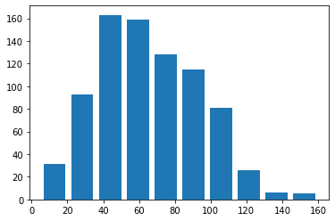
df['speed'].describe()
count    807.000000
mean      65.830235
std       27.736838
min        5.000000
25%       45.000000
50%       65.000000
75%       85.000000
max      160.000000
Name: speed, dtype: float64
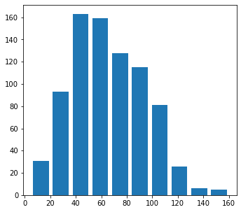
plt.hist(data= df, x = 'speed',rwidth=0.8)
plt.show()
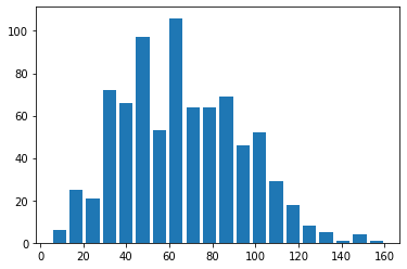
# 빈의 갯수를 변경하는 경우! bins = 개수.
#
plt.hist(data= df, x = 'speed',rwidth=0.8,bins = 20)


plt.show()
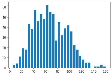
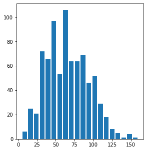
# 빈의 범위를, 단위로 조절하는 경우
# 이때는, 최소값과 최대값을 구해서
# np.arange 함수로 범위를 만들어준다.
my_range = np.arange(5,160+5, 5)
plt.hist(data= df, x = 'speed',rwidth=0.8,bins = my_range)


plt.show()
Figures, Axes and Subplots
# 하나에 여러개의 plot을 그린다.
# plt.subplot(행,전체열, 해당열)

plt.figure(figsize=(12,5))

plt.subplot(1,2,1)
plt.hist(data = df, x='speed', rwidth= 0.8,bins=10)

plt.figure(figsize=(10,5))

plt.subplot(1,2,2)
plt.hist(data = df, x='speed', rwidth=0.8, bins= 20)

plt.show()
Bivariate (2개의 변수) Visualization 방법
Scatterplots
import numpy as np
import pandas as pd
import matplotlib.pyplot as plt
import seaborn as sb
%matplotlib inline
cars = pd.read_csv('fuel_econ.csv')
# 배기량과 연비의 관계를 차트로 그리기
# displ, comb
plt.scatter(data=cars,x='displ',y='comb')
plt.xlabel('Displacement (L)')
plt.ylabel('Combined Fuel Eff (mpg)')
plt.title('Displ vs Comb')
plt.show()
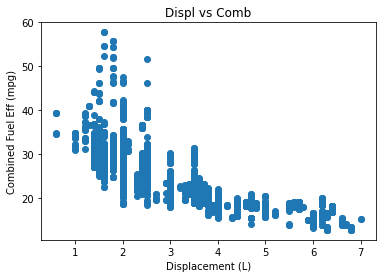
cars[ ['displ','comb'] ].corr()
| displ | comb | |
|---|---|---|
| displ | 1.000000 | -0.758397 |
| comb | -0.758397 | 1.000000 |
# regression(리그레션,회기) : 데이터에 fitting 한다는 의미
plt.figure(figsize=(12,5))
sb.regplot(data=cars,x='displ',y='comb')
plt.xlabel('Displacement (L)')
plt.ylabel('Combined Fuel Eff (mpg)')
plt.title('Displ vs Comb')
plt.show()
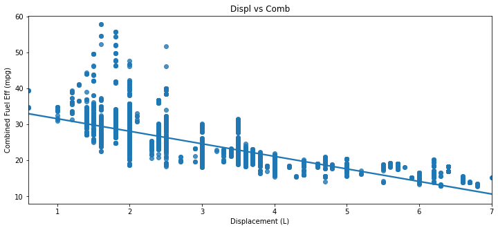
스케터는, 여러 데이터가 한군데 뭉치면 보기 힘들다. 이를 어떻게 해결할것인가
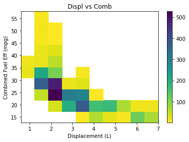
Heat Maps : 밀도를 나타내는데 좋다.
plt.hist2d(data=cars,x='displ',y='comb',cmin=0.5, cmap='viridis_r')
plt.colorbar()
plt.xlabel('Displacement (L)')
plt.ylabel('Combined Fuel Eff (mpg)')
plt.title('Displ vs Comb')
plt.show()
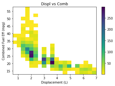
plt.hist2d(data=cars,x='displ',y='comb',cmin=0.5, cmap='viridis_r', bins= 20)
plt.colorbar()
plt.xlabel('Displacement (L)')
plt.ylabel('Combined Fuel Eff (mpg)')
plt.title('Displ vs Comb')
plt.show()
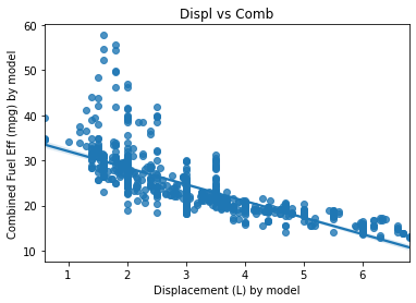
# model 기준 displ과 comb의 관계를 차트로 그리세요
# 단, displ과 comb는 각 차종의 평균값으로 합니다.
displ= cars.groupby('model')['displ'].mean()
comb = cars.groupby('model')['comb'].mean()
sb.regplot(data=cars,x=displ,y=comb)
plt.xlabel('Displacement (L) by model')
plt.ylabel('Combined Fuel Eff (mpg) by model')
plt.title('Displ vs Comb')
plt.show()
한글 처리를 위해서는, 아래 코드를 실행하시면 됩니다.
import numpy as np
import pandas as pd
import matplotlib.pyplot as plt
import seaborn as sb

%matplotlib inline

import platform

from matplotlib import font_manager, rc
plt.rcParams['axes.unicode_minus'] = False

if platform.system() == 'Darwin':
    rc('font', family='AppleGothic')
elif platform.system() == 'Windows':
    path = "c:/Windows/Fonts/malgun.ttf"
    font_name = font_manager.FontProperties(fname=path).get_name()
    rc('font', family=font_name)
else:
    print('Unknown system... sorry~~~~')
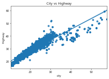
문제 1. 위에서 city 와 highway 에서의 연비 관계를 분석하세요. (스케터 이용)
sb.regplot(data=cars,x='city',y='highway')
plt.xlabel('city')
plt.ylabel('Highway')
plt.title('City vs Highway')
plt.savefig('chart1.jpg')
plt.show()
문제 2. displ과 이산화탄소 배출량의 관계를 분석하세요. (히트맵으로) displ 이 엔진사이즈이고, co2 가 이산화탄소 배출량입니다.
plt.hist2d(data=cars,x='displ',y='co2',cmin=0.5, cmap='viridis_r', bins= 20)
plt.colorbar()
plt.xlabel('배기량')
plt.ylabel('이산화탄소 배출량')
plt.title('배기량 vs 이산화탄소 배출량')
plt.show()
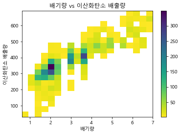
cars[['displ','co2']].corr()
| displ | co2 | |
|---|---|---|
| displ | 1.000000 | 0.855375 |
| co2 | 0.855375 | 1.000000 |
MARKERS AND LINE STYLES
- plt.plot(x, y, linestyle=’–’, marker=’o’, color=’b’)
- plt.plot(x, y, ‘–bo’)
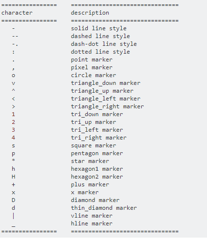
Reference: https://stackoverflow.com/questions/8409095/matplotlib-set-markers-for-individual-points-on-a-line
댓글남기기