머신러닝 - KNN
K-Nearest Neighbor
다음처럼 카테고리가 레이블링 되어 있는 데이터가 존재합니다.
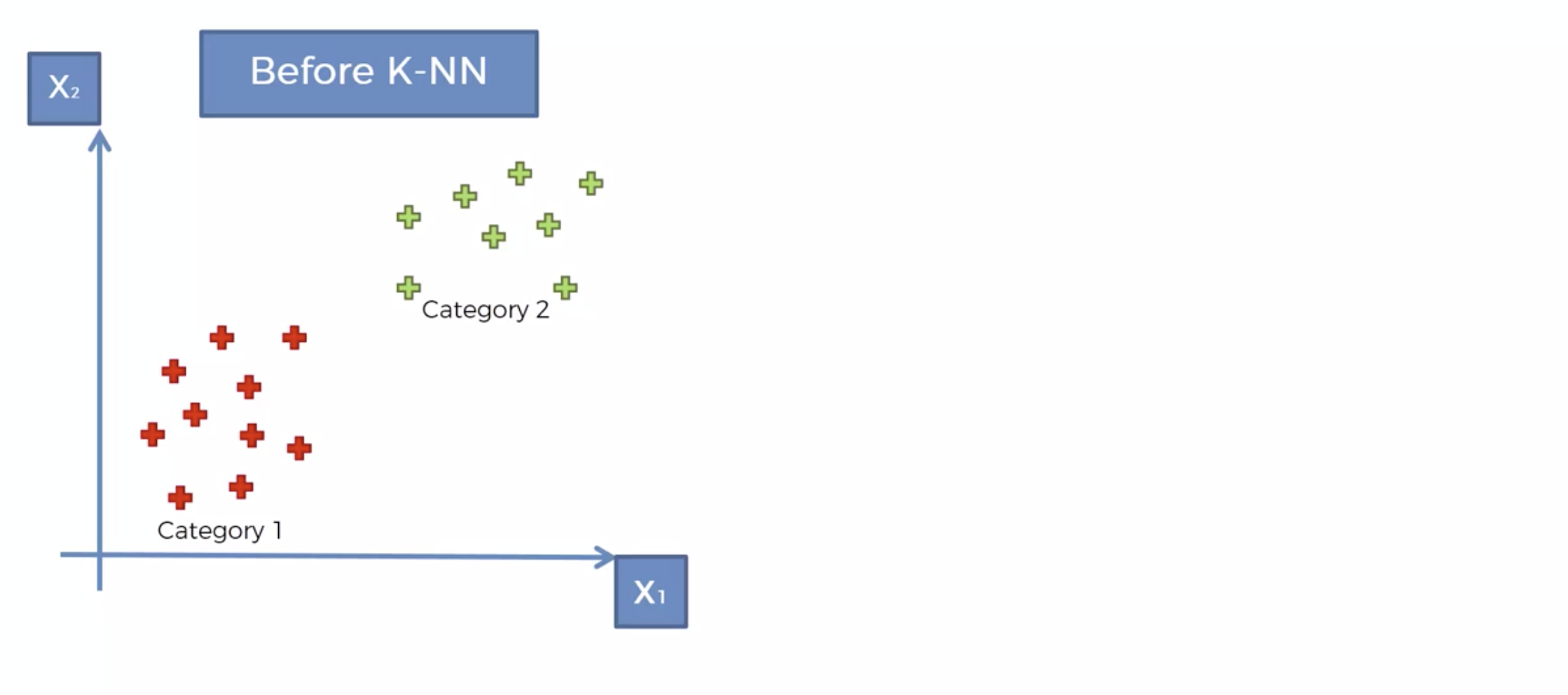
새로운 데이터가 생겼을때, 이를 어디로 분류해야 할까요?
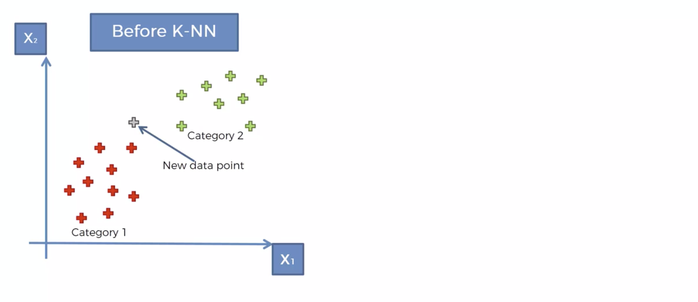
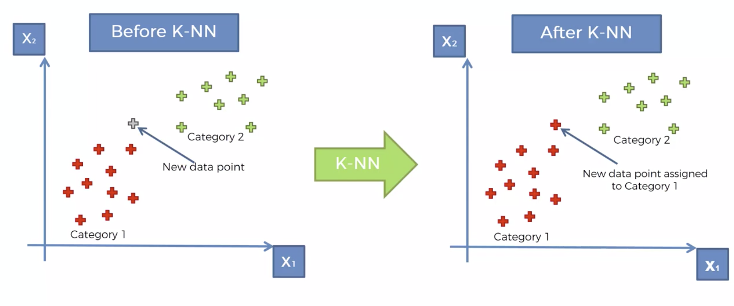
왜 빨간색으로 분류를 했을까요.
KNN 알고리즘
내 주위에 몇개의 이웃을 확인해 볼것인가를 결정한다. => K
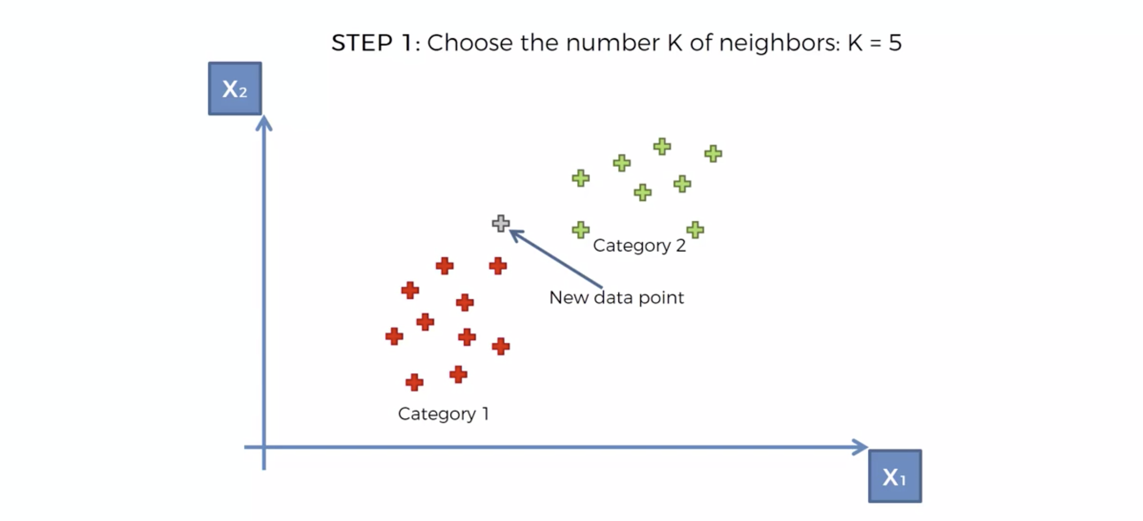
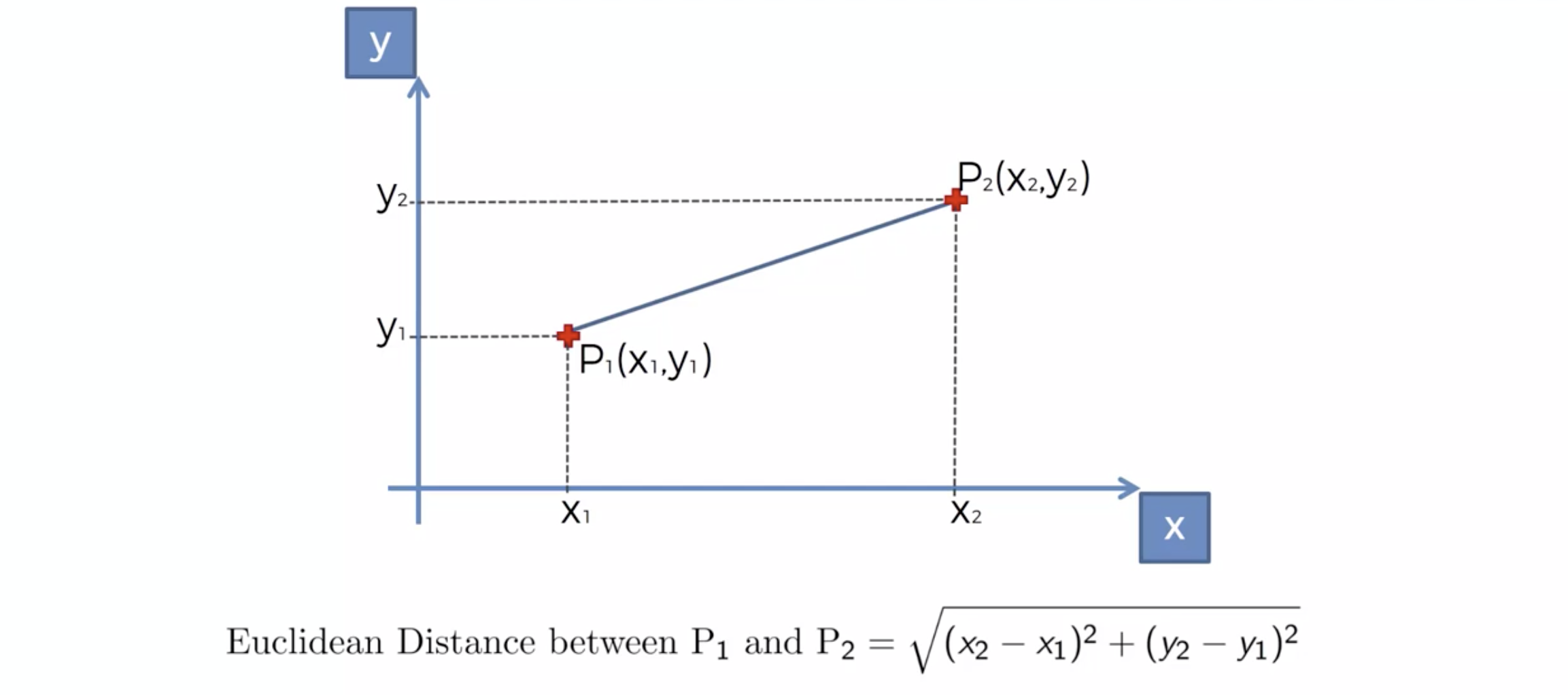
새로운 데이터가 발생 시, Euclidean distance 에 의해서, 가장 가까운 K 개의 이웃을 택한다.
K 개의 이웃의 카테고리를 확인한다.
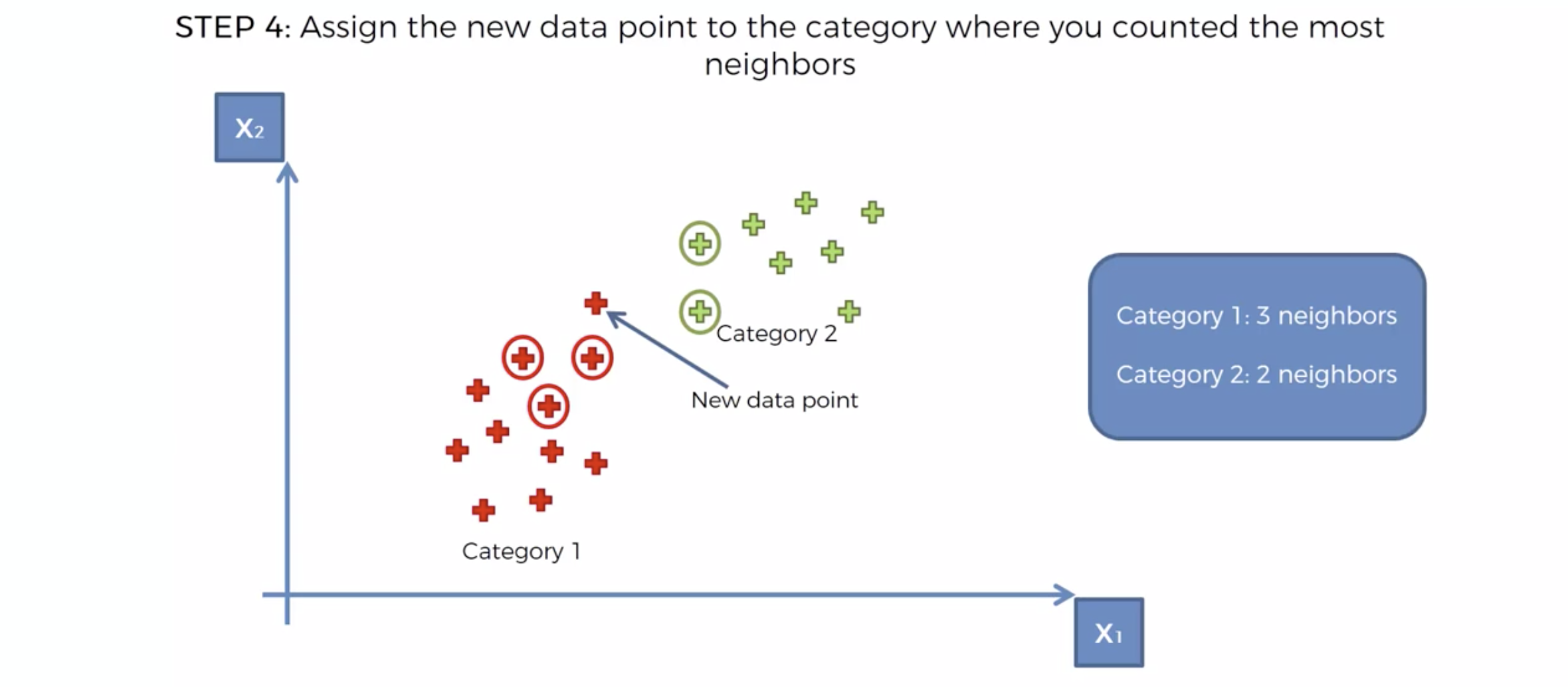
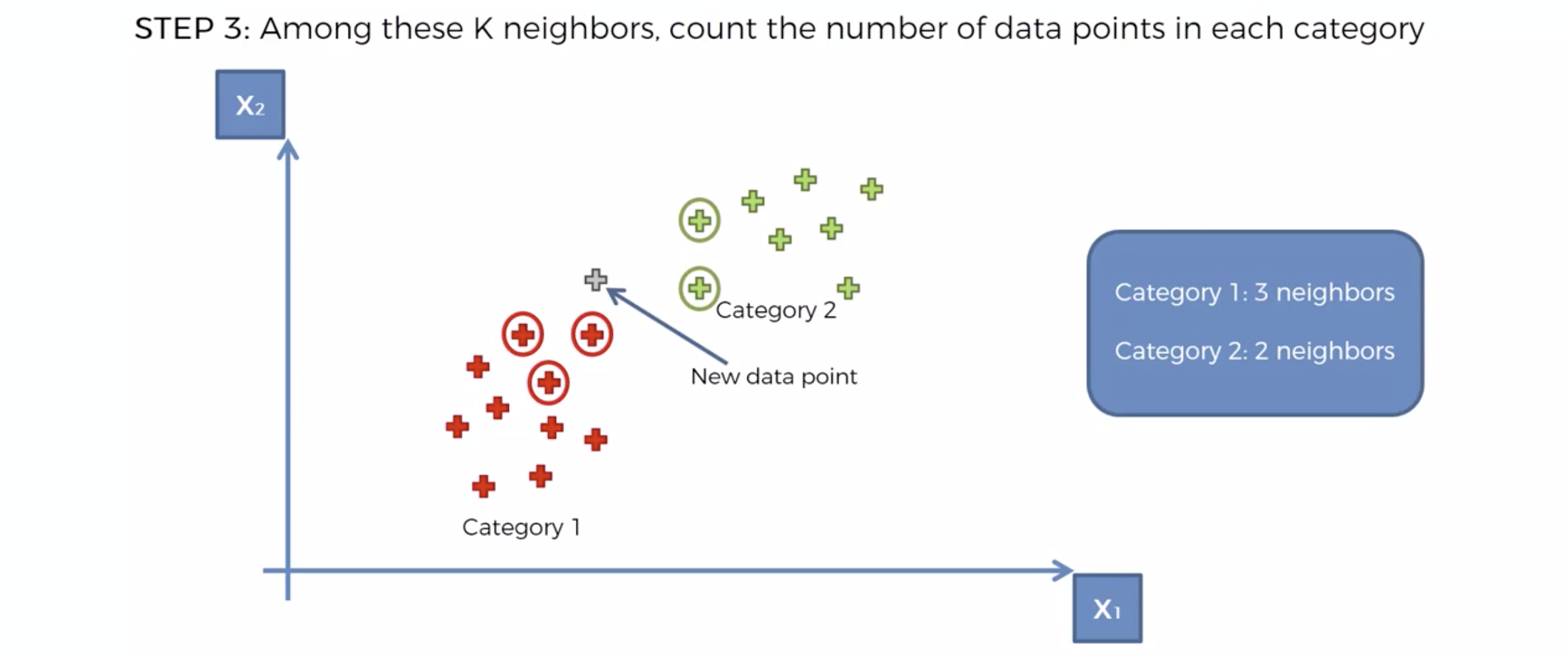 카테고리의 숫자가 많은 쪽으로, 새로운 데이터의 카테고리를 정해버린다.
import numpy as np
import pandas as pd
import matplotlib.pyplot as plt
import seaborn as sb

%matplotlib inline

import platform

from matplotlib import font_manager, rc
plt.rcParams['axes.unicode_minus'] = False

if platform.system() == 'Darwin':
    rc('font', family='AppleGothic')
elif platform.system() == 'Windows':
    path = "c:/Windows/Fonts/malgun.ttf"
    font_name = font_manager.FontProperties(fname=path).get_name()
    rc('font', family=font_name)
else:
    print('Unknown system... sorry~~~~')
df = pd.read_csv('Social_Network_Ads.csv')
KNN 모델링
1. 데이터 분석
df.head()
| User ID | Gender | Age | EstimatedSalary | Purchased | |
|---|---|---|---|---|---|
| 0 | 15624510 | Male | 19 | 19000 | 0 |
| 1 | 15810944 | Male | 35 | 20000 | 0 |
| 2 | 15668575 | Female | 26 | 43000 | 0 |
| 3 | 15603246 | Female | 27 | 57000 | 0 |
| 4 | 15804002 | Male | 19 | 76000 | 0 |
2. 데이터 가공(피쳐 스케일링)
X = df.iloc[:,[2,3]]
y = df['Purchased']
from sklearn.preprocessing import StandardScaler
scaler = StandardScaler()
X = scaler.fit_transform(X)
3. 인공지능 학습
from sklearn.model_selection import train_test_split
X_train,X_test,y_train,y_test = train_test_split(X,y,test_size = 0.2,random_state= 3)
# KNN 으로 모델링
from sklearn.neighbors import KNeighborsClassifier
classifier = KNeighborsClassifier(n_neighbors=5)
classifier.fit(X_train,y_train)
KNeighborsClassifier()
y_pred = classifier.predict(X_test)
4. 인공지능 테스트
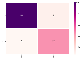
from sklearn.metrics import confusion_matrix
cm = confusion_matrix(y_test,y_pred)
from sklearn.metrics import classification_report
print(classification_report(y_test,y_pred))
              precision    recall  f1-score   support

           0       0.94      0.91      0.93        55
           1       0.81      0.88      0.85        25

    accuracy                           0.90        80
   macro avg       0.88      0.89      0.89        80
weighted avg       0.90      0.90      0.90        80
sb.heatmap(data=cm,annot=True,cmap='RdPu',linewidths=0.5)
plt.show()
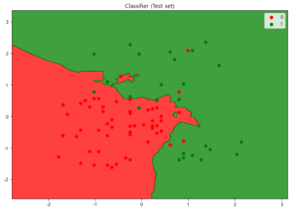
# Visualising the Test set results
from matplotlib.colors import ListedColormap
X_set, y_set = X_test, y_test
X1, X2 = np.meshgrid(np.arange(start = X_set[:, 0].min() - 1,
                               stop = X_set[:, 0].max() + 1, step = 0.01),
                     np.arange(start = X_set[:, 1].min() - 1,
                               stop = X_set[:, 1].max() + 1, step = 0.01))
plt.figure(figsize=[10,7])
plt.contourf(X1, X2, classifier.predict(
            np.array([X1.ravel(), X2.ravel()]).T).reshape(X1.shape),
             alpha = 0.75, cmap = ListedColormap(('red', 'green')))
plt.xlim(X1.min(), X1.max())
plt.ylim(X2.min(), X2.max())
for i, j in enumerate(np.unique(y_set)):
    plt.scatter(X_set[y_set == j, 0], X_set[y_set == j, 1],
                c = ListedColormap(('red', 'green'))(i), label = j)
plt.title('Classifier (Test set)')
plt.legend()
plt.show()
*c* argument looks like a single numeric RGB or RGBA sequence, which should be avoided as value-mapping will have precedence in case its length matches with *x* & *y*.  Please use the *color* keyword-argument or provide a 2-D array with a single row if you intend to specify the same RGB or RGBA value for all points.
*c* argument looks like a single numeric RGB or RGBA sequence, which should be avoided as value-mapping will have precedence in case its length matches with *x* & *y*.  Please use the *color* keyword-argument or provide a 2-D array with a single row if you intend to specify the same RGB or RGBA value for all points.
# 직선 : linear
# 직선이 아닌것들(지맘대로인것들) : non-linear
댓글남기기